featured reads
Designing New Amsterdam F.C.’s ‘dutch inspired’ away kit.
September 8th 2020
5 Minute read
Christopher Payne is an award-winning British designer and passionate football fan. Backed up by his knowledge of football and the execution in design, Payne creates stylish, unique practical and relevant designs for ambitious and forward-thinking football clubs that are looking to progress both on and off the pitch.
Payne has worked with many football clubs and organizations around the world, designing iconic new logos and creating a detailed branding system, that makes the football club standout, grow off the pitch, and thrive in the modern world.
You can see examples of Payne’s work by clicking here.
Contact me
¿Hablas español? Yo también. Contactarme.
New Amsterdam football club is a new professional football club based in New York City. Earlier this year, I worked with Laurence Girard (President), Max Mansfield (Sporting Director) and Michael Hitchcock (Strategic Advisor) on designing the football club’s logo and building the New Amsterdam Football Club Brand.
You can find out more about the brand that we created by clicking on the link below – but for now, we are talking kit design – In particularly New Amsterdam F.C.’s dutch inspired away kit.
Read the blog post – Designing New Amsterdam F.C.’s brand
https://www.footballbranddesigner.com/design-new-amsterdam-football-clubs-brand/
New Amsterdam F.C. home kit design done! Now onto the away kit.
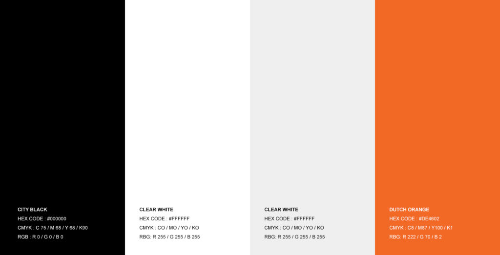
The brand that we created for New Amsterdam F.C. was built upon a colour scheme of black and white – with orange as it’s accent colour.
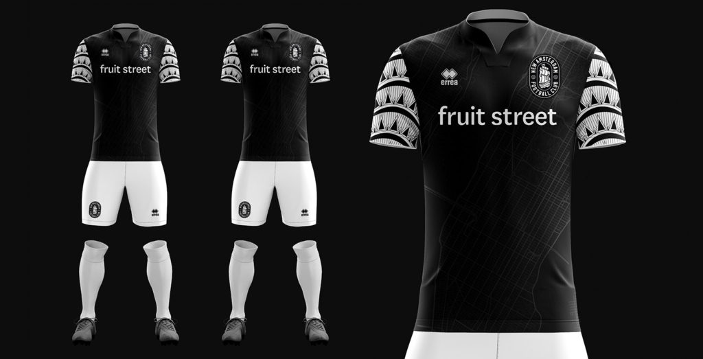
I had recently designed the New Amsterdam F.C. home kit and used black and white as the principle colour scheme.
You can learn more about NAFC’s home kit design here : https://www.footballbranddesigner.com/designing-new-amsterdam-f-c-s-first-ever-home-kit-and-the-meaning-behind-the-design/
With black and white used for the home kit – I knew exactly which colour palette I would tap into for the club’s first-ever away kit – Dutch orange.
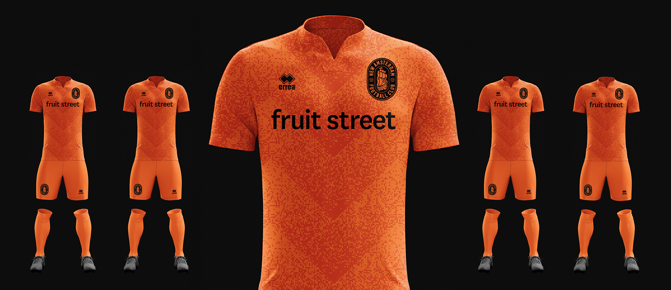
All orange. Orange shirts. Orange shorts. Orange socks.
Max Mansfield (New Amsterdam F.C.’s sporting director) and I, decided that with the home kit being black and white, the away kit should be all orange shirts, shorts and socks – all orange.
Keen to flex my design creativity and appreciation for iconic designs in the world of football, I looked to give this away kit additional meaning.
The Dutch national team that competed in the European Championships of 1988 had a shirt design that featured a gradient dot pattern – a gradient that evolved from orange to white. I studied and took great inspiration from this design, as I know that it has a special place in football design history, and so I wanted to subtly reference this in my designs for New Amsterdam F.C’s away kit.
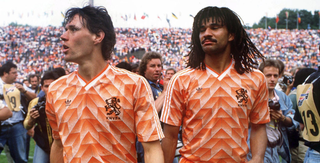
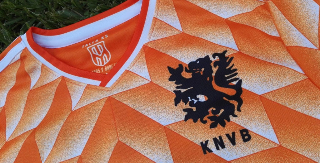
Creating a modern version of 1988 pattern
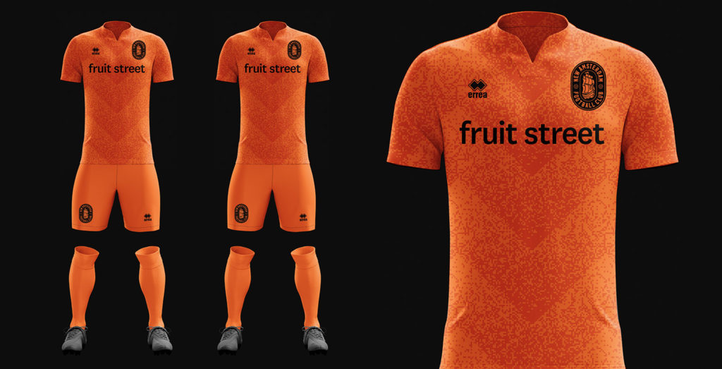
To reference, and pay homage, to the Dutch, and the classic dutch shirt of 1988, I created a similar pattern that would have a similar (though different) texture. As you can see below, the pattern was made up of tiny squares (pixels, if you like) that formed an interesting gradient pattern that evolved from orange to a slightly darker orange. These patterns would be encompassed in triangular shapes and be repeated throughout the kit.

With the pattern looking great, I added the football club’s logo (read the story behind the logo), the club’s sponsor (FruitStreet) and the club’s kit manufacturer (Errea).
To test the design and see how it would look in ‘kit form’, I created 3D digital mock-ups of the kit to see how the shirt would look when accompanied by the shorts and socks. As you can see below, it looked great! It had a bold and confident feel. It certainly encapsulated the dutch feeling that we set out to create, and it subtly referenced an iconic and well-respected piece if football history – The Holland 1988 kit design.
I shared the design with New Amsterdam F.C.’s ownership groups and it was instantly liked! We moved forward into production.
Working with Errea
New Amsterdam F.C. had signed a deal with Errea to be the football clubs, official kit supplier. This was such a great decision. Errea work with many of the world’s top clubs are a joy to work with. They are a great organization with great tradition and momentum.
I worked with their team to ensure that the production was as good as the design, and the vision was executed flawlessly. Errea’s team worked alongside me every step of the way, sending me digital proofs and samples to approve. They are an organization that I would recommend and hope to work with again.
First look at the club’s first-ever away kit
The first look at this new design came on September the 1st when the New Amsterdam F.C. twitter (@NAFCNY) account tweeted the image below, and then the club used the full kit in the NISA game against Detroit City FC.
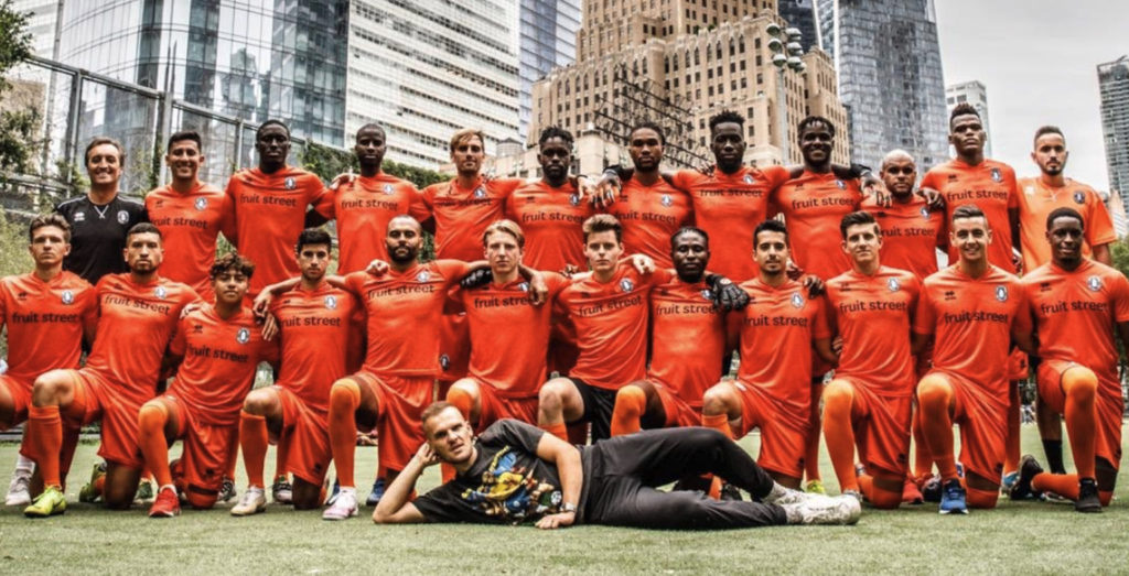


Photo Credit: Michael Mansfield
Conclusion.
The process of designing a football kit is an exciting one. The key is finding relevance in the design, and ensuring that the design has a meaning and a story behind it.
I have huge admiration of all that New Amsterdam F.C. are doing, and how they dare to be different and stand out as Club of the People. They gave me full creative freedom to design something interesting, and I am grateful for that.
Against a backdrop of templatized, and ‘off-the-shelf’ kits, that were available to the football club, NAFC strived to create something different, something unique and something relevant to them. By having a custom-designed kit, they brought the brand to life, and now stand out above other teams in New York City, and in their league.
New Amsterdam F.C. inaugural season away kits on sale today.
Today the football club are proud to launch these kits. They are available for purchase on the football club’s website: https://newamsterdamfc.com/shop
Further reading
– New Amsterdam F.C. case study
– New Amsterdam F.C. brand guidelines
– New Amsterdam F.C. brand video
– Designing New Amsterdam F.C.’s brand
– Got questions? Want to start a project?
 Back
Back 