featured reads
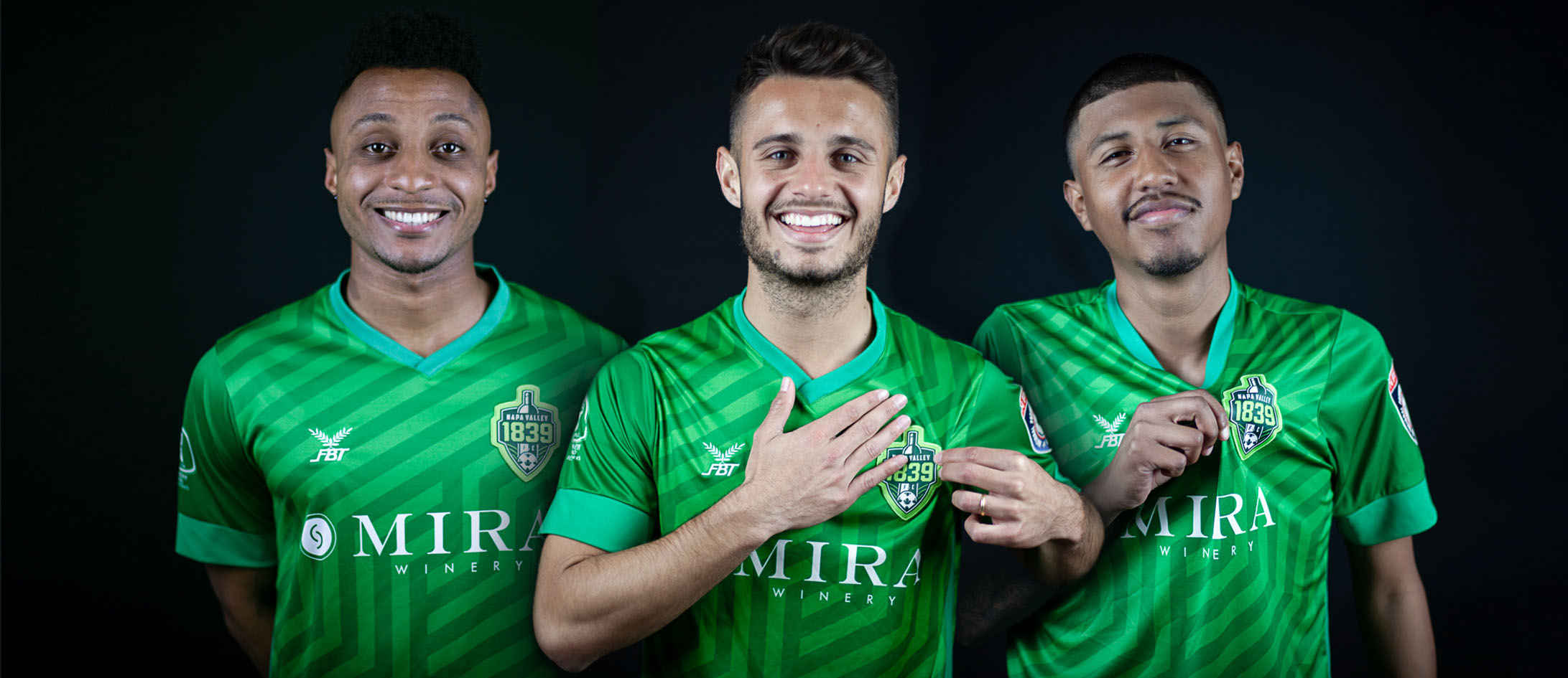
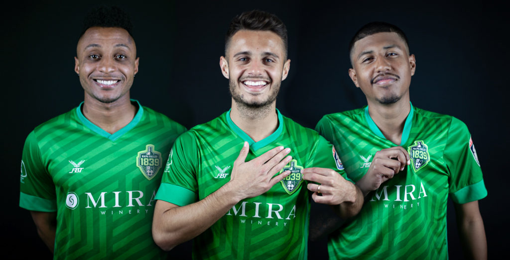
Designing Napa Valley 1839 F.C.’s vineyard inspired kits
May 3rd 2020
8 Minute read

Christopher Payne is an award-winning British designer and passionate football fan. Backed up by his knowledge of football and the execution in design, Payne creates stylish, unique practical and relevant designs for ambitious and forward-thinking football clubs that are looking to progress both on and off the pitch.
Payne has worked with many football clubs and organizations around the world, designing iconic new logos and creating a detailed branding system, that makes the football club standout, grow off the pitch, and thrive in the modern world.
You can see examples of Payne’s work by clicking here.
Contact me¿Hablas español? Yo también. Contactarme.
In 2016, I designed the Napa Valley 1839 F.C.’s logo. It was groundbreaking, it was instantly iconic, and it set Napa Valley 1839 F.C. up for success (Read the full story of this rebrand here https://www.footballbranddesigner.com/case_study/napa-valley-1839-football-club/).
After the football club’s logo launched, I stayed in touch with the club’s ownership group, maintaining a very positive relationship with them. Occasionally consulting on design projects. Over time I watched the football club develop, grow, and win the hearts of the Napa Valley community.
Then in 2018 – Arik Housley, one of the members of the Napa Valley 1839 F.C.’s ownership group reached out to me. Explaining that the football club wants to increase their merchandise sales, and desired to have a new, iconic playing kit to kick-off the new season.
He followed up by asking me if I would be interested in taking on the challenge of designing the football club’s official kits for the 2018/2019 season.
I immediately said ‘YES’!
Finding inspiration in the football club’s local area.
My starting point in creating the new kit was to ensure that it’s design would be highly relevant to Napa Valley. I wanted the football club to have a kit design that looked cool and stylish, wearable and progressive. But, I also wanted the design to speak to the fans, and reference the local area.
Napa Valley is known for its thriving wine industry and picturesque scenery. Locals, and the many tourists who visit the area. Are instantly surrounded by green rolling hills that are covered in wineries and vineyards. These vineyards form an interesting and unique, striped texture on the landscape. It is a beautiful sight, and it became the inspiration for my kit designs.

I was intrigued by the straight lines that the vineyards formed.
Vineyards are planted in such a way that enables them to capture as much sun as needed. This is done in order to produce the best wine, and a lot of it. They’ve turned it into an art, and it is seen time and time again in and around Napa Valley.
Visually I was fascinated how these rows of grapes all remained the exact same distance away from each other. There is a disciplined feel to the way these grape vines grow. Additionally, I became intrigued by how one vineyard met another vineyard. And by doing so, how the rows of grapevines suddenly changed direction. Understanding this tactic, I set out to create a base pattern for the football club’s kits that would be inspired by the vineyards of Napa Valley.
Building the pattern.
I created a pattern that would be as disciplined and organized as a vineyard. A pattern that is based on a set of lines that would form an interesting, but organized appearance (these lines would represent the rows of grape vines). Each row would be equally distanced from each other (like the grapevines), and the rows would change direction often, to keep the design interesting and lively.

I created a design system which blended aesthetics with mathematics. Furthermore I decided to document the rules of the pattern.
- The lines can only flow vertically (90 degrees) and at a downward diagonal angle of 30 degrees. This formation keeps the design organized and consistent.
- The pattern must never form a T junction.
- There must always be negative space between the end of a row and the start of another.
- The changes in direction should happen frequently to keep the design interesting, and be optically spaces out from one another
Adding colour to the kit design.
With the base pattern complete, I then started to look at how the pattern would work with different colours.
When originally designing the Napa Valley 1839 F.C. brand, I proposed that the football club’s principle colours would be green and white. The ownership group originally wanted the club’s colours to be red and black. But ultimately agreed with my recommendation of making the club’s primary colours green and white. So I designed the pattern using two varying tones of green.
It was important that the pattern wasn’t high contrast, such as the black and white version above. I understood the importance of visual hierarchy within the kit design and I wanted the pattern to be noticable. But not the first thing you notice, I didn’t want the pattern to get in the way of other elements that would be placed on the shirt.
I wanted the pattern to be a canvas to place the other elements on top of. Allowing them to stand out on the kit, such as the logo and the football club’s shirt sponsors. So to minimize the high contrast look, I chose two shades of green that were near each other on the colour chart.

Building the design.
With the pattern design done, documented, and with colour added. I began to build this into the kit, mocking up how it would look. I added the logo design on the right side of the chest, along with other key components that make up the kit – such as the club’s sponsors. Then I documented the sizing and placement of the logo alongside other elements that go on the design.


Selling to sponsors.
I often use a high fidelity 3D ‘mock up’ of how the new kit could look. This not only brings the designs to life, but it offers a good insight into how the kit may look in the real world. It also is a great asset that the football club can use when looking to sell sponsorship deals.
Businesses actively want to associate with positive, and progressive sports teams in the local area. So when a kit design looks great, while accurately representing the local area. This can often increase the team’s chance of acquiring sponsorship deals, and persuade businesses to get involved more effectively when they see the kit design rendered in a 3D fashion.

Home kit done, now what about the away kit.
With the pattern working so well on the new home kit, it made sense to reuse it on the football club’s away kit. This ensured visual consistency across the club’s playing kits and brand.
NOTE: The pattern would also be used in other areas of the brand, to give the football club a consistent and unified look and feel.
As the home kit design uses two shades of green. I wanted the football club’s away kit to be burgundy, to reference Napa Valley’s association with the wine industry – in particular red wine.

In picking colours for the away kit, I referenced the rich tones and textures seen in a glass of red wine. I settled on two deep shades of burgundy picking two colours that were close to each other on the colour chart. This way the pattern can be used as a detailed and intriguing canvas for other elements to stand out on the shirt.
The away kit design would further link Napa Valley 1839’s F.C. with the wine industry, and be a great alternative to the home kit.
The benefits of an adaptable logo.
When I designed the original Napa Valley 1839 F.C. logo in 2016. I provided the football club with the full colour version of the logo (the logo design that is always used on the home kit), as well as the secondary logo – a version of the logo that has the exact same structure and design as the primary logo, yet it is simplified in the amount of colours are used.


The secondary logo was designed to be adaptable and change its base colour to suit the environment in which it is placed. In this instance as the football club’s away kit would be burgundy, the secondary logo has the flexibility to change its base colour to burgundy, with the logo detail being white. It is this flexibility that makes for a successful logo design.


Huge success.
With the new kits designed, the football club was able to secure more sponsorship deals than ever before.
Ultimately, due to the jersey’s unique design, and social media marketing campaign, the club sold more kits than it ever had. Fans would buy the kits at the game and online, and proudly wear these unique designs in and around Napa Valley.
Additionally, the local press and national press wrote articles about the kit design. See here: https://www.protagonistsoccer.com/uniformity/napavalley1839
Quote:
“Chris Payne is not only the designer of the 1839 FC crest but also our current jerseys. Chris did an amazing job in bringing the Napa Valley vineyards to life in our kits.
“We love our kit! By far we all agree that the 2019 kit designed by Chris Payne is our favorite out of the three so far. It represents our Valley very well and pays honor to all those who work very hard to maintain the vineyards looking beautiful.”
Locals, and tourists in and around Napa Valley can often be seen wearing Napa Valley 1839 F.C. ‘s bespoke jerseys. The designs not only promote, and market the football club, but also promote the football clubs sponsors.


 Back
Back