featured reads
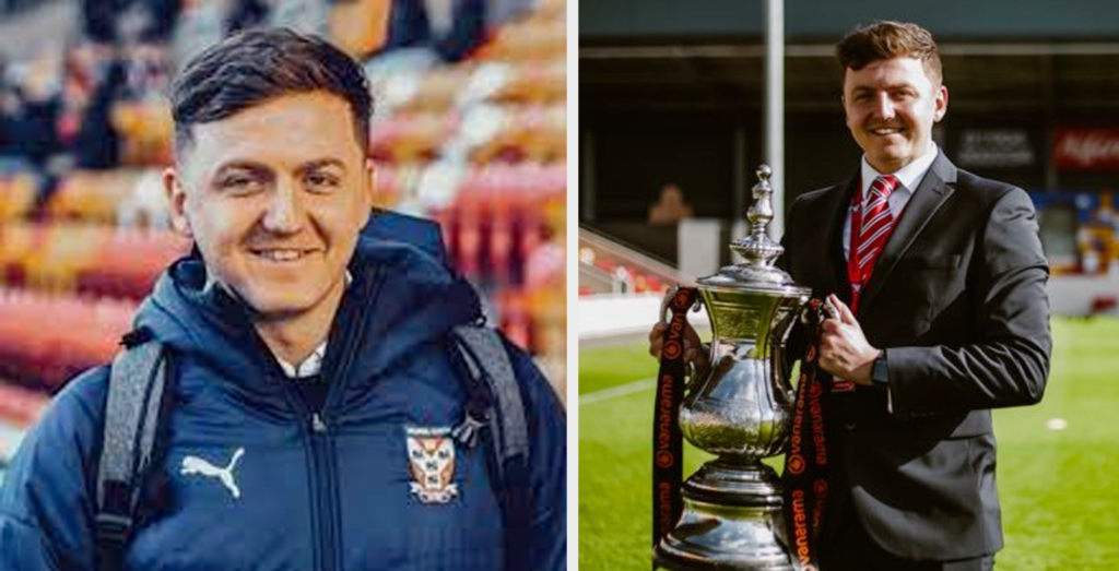
An interview with Dan Simmonite – York City Football Club’s Media Officer
July 6th 2022
5 Minute read
Christopher Payne is an award-winning British designer and passionate football fan. Backed up by his knowledge of football and execution in design, Payne creates stylish, unique, practical and relevant designs for ambitious football clubs that are looking to progress both on and off the pitch.
Contact me¿Hablas español? Yo también. Contactarme.
What do you do at York City Football Club?
My official title is Media Officer for York City Football Club who play in the National League (Tier 5 of the English pyramid), and I manage all of the digital output, brand and press activity for the club.
What do you love about your job?
We are a department of just one at York City so the benefit to that is I have full creative freedom when it comes to projects or how we run the social media for the club. This also comes with a lot of responsibility and fan engagement is key. What I love most about my job is the interactions with the supporters and listening and providing what they want from my department – I think that is the key to the success of a football club.
Why did you decide to rebrand York City FC?
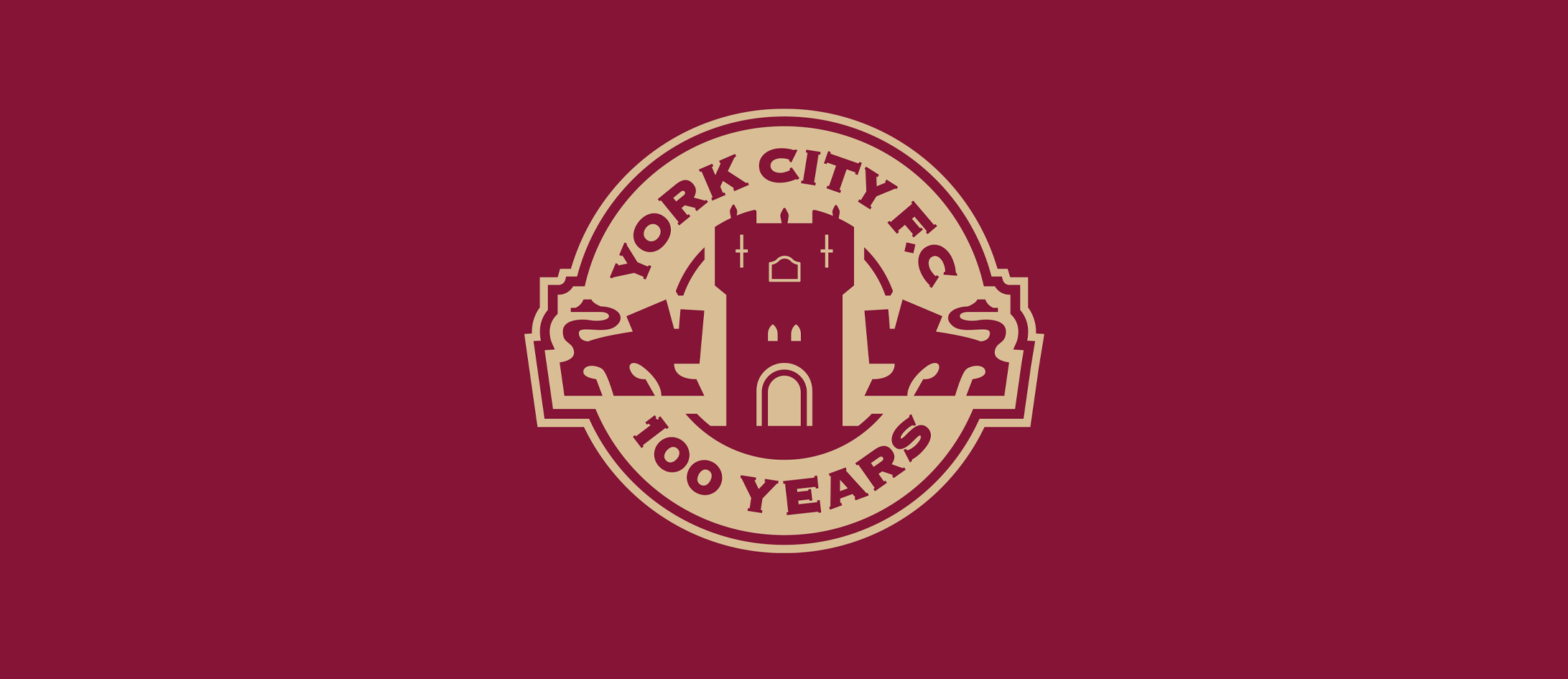
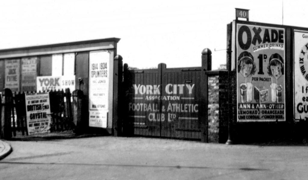
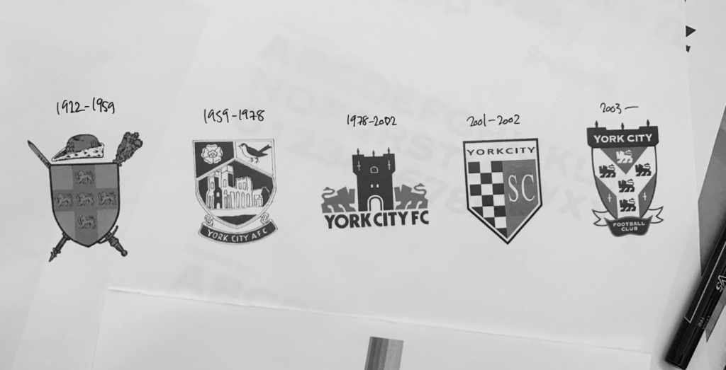
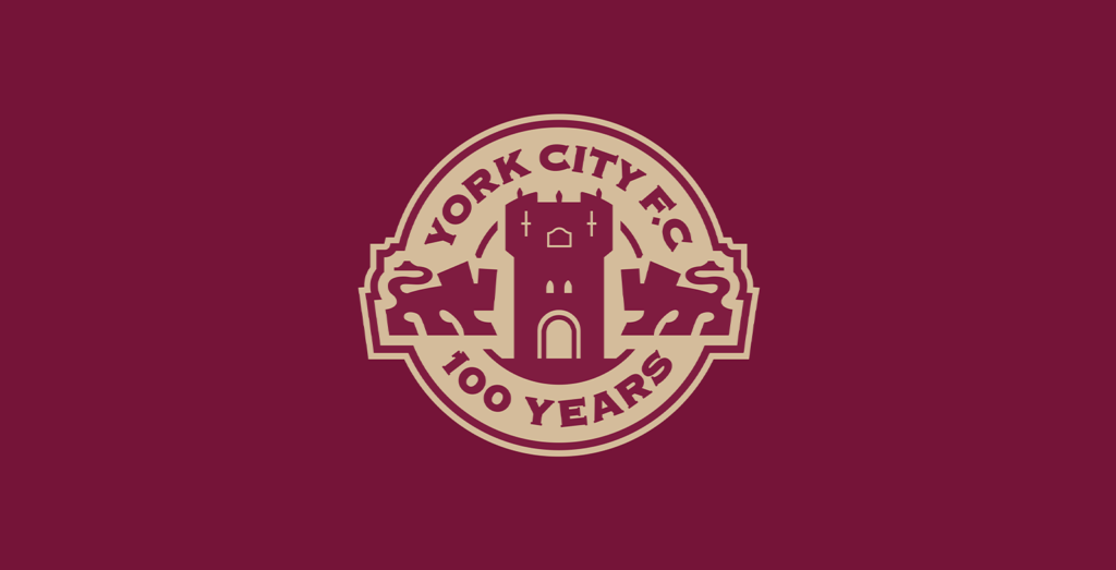
It was approaching our 100 year anniversary as a football club and we saw this as a fantastic opportunity not only commercially but brand-wise to symbolise and capture the imagination of fans with a new club crest to mark the Centenary year.
What were you excited about going into the project?
I was excited that it was such a big project and a huge part of the club’s history which I was tasked to source and deliver on. I am also very passionate about the club being a supporter myself and born and raised in the City of York, so it was a very proud moment for me being involved at such a prestigious time. I was also excited about working with Chris having seen him deliver some fantastic work for other clubs.
Why did you choose to collaborate with Chris Payne?
I had seen Chris’ recent work at Eastleigh F.C. and how well that had gone down on social media and amongst their fans. Following this I invited Chris on my podcast ‘The Press Conference’ to chat about the whole process and I was fully engaged the whole time – I had to work with him at the first opportunity.
See Eastleigh Football Club rebrand.
Read the behind the scenes story of Eastleigh Football Club’s rebrand.
Watch ‘Chapters’: Eastleigh Football Club’s logo launch film.
What was it about Chris’s work that made you want to work with him?
I liked the process he went through with other badges, involving the fans and creating identities with historical meaning which aligned exactly with what we wanted at York City. Chris also has a certain style which is conducive to the digital era which was very important for me personally as I could utilise the new crest on social media to maximum effect.
Which of Chris’s previous crest designs do you like the most and why?
I was drawn to Chris from his work on the Eastleigh badge – the whole concept behind the spitfire and how this symbolises Eastleigh as a location just sits right. The colours and typography also represent the brand perfectly.
See Eastleigh Football Club rebrand.
Read the behind the scenes story of Eastleigh Football Club’s rebrand.
Watch ‘Chapters’: Eastleigh Football Club’s logo launch film.
What was the process like?
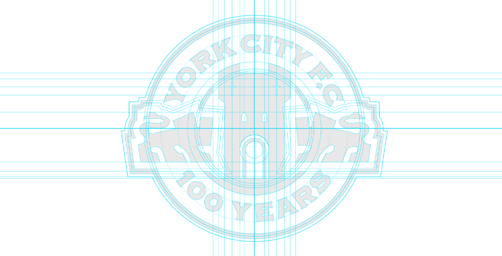
The process was very seamless, and Chris was engaged the entire time, offering his own insights to design changes as well as listening to our fans and the club on what would work best from a historical standpoint. I feel Chris’ open approach allowed us to collaborate on something very special which involved every single stakeholder from the fans to the directors and the owner. Our deadline for completion also moved several times which did not phase Chris and he was flexible enough to work on a very tight deadline.
Tell us about the special edition home kit… How did that idea come about? Why did you want to do a special edition kit?
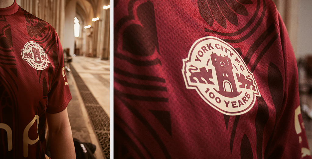
We really wanted something that represented York as a city. That meant using the stunning roman architecture we have at our doorstep and what better than to use the main landmark which is the York Minster. We also wanted to represent our club’s history and to go back to our original maroon colour was a no brainer.
We wanted something bold and something that would appeal to not just York City fans and the people of York but football fans and shirt collectors in general to help put us on the map worldwide and open commercial opportunities abroad. I think we achieved that with a full year’s worth of stock selling out in 6 days in addition to being on track to be the best-selling York City kit ever.
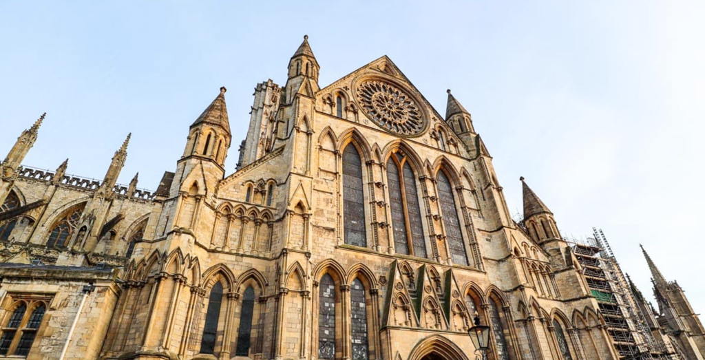
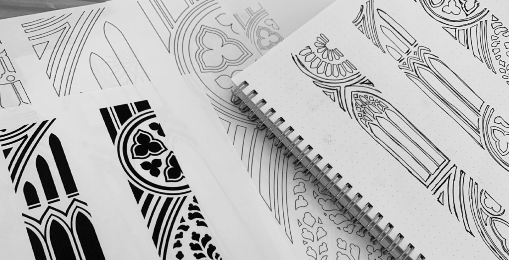

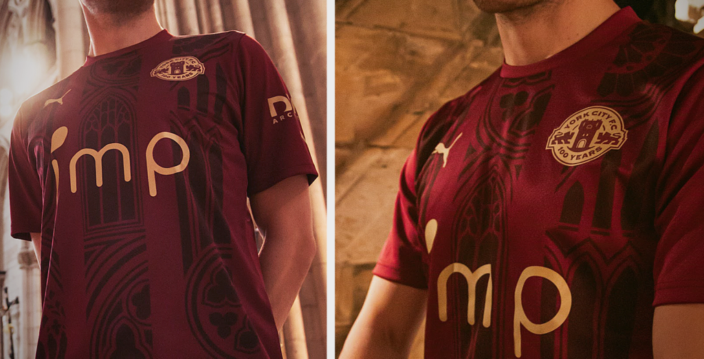
Ok day of the launch… How did you launch the new crest? And kits Can you tell us a little bit about the launch plan you devised?
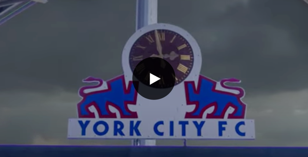
Throughout the project we both pushed the aspect of meaning and everything had to sit within the York brand. We built up a full day of content to launch the crest in which the centrepiece was a showcase video by Chris which built suspense tremendously. The digital-first launch really pushed the brand further and prompted other publications to latch onto the news which in turn really brought the brand to a wider audience.
What Time: The video that launched York City F.C.’s new identity.
Tell us about launch day – what was that like before and after sending that first tweet?
I knew before hitting send on the tweets that it was instantly going to be a hit. The path we walked with the project and the plan in place gave me confidence in executing a successful campaign and this is credit to the work Chris produced. Low and behold May was our most successful month on social media to date, with 17million impressions with a 4.2% engagement rate on Twitter alone which in that particular month was up 300% on our average.

What was the fan’s reaction like?
The fans’ reaction was better than I could have ever expected. Everything sat well with them, and I feel we really got across the meaning behind the kit designs and club crest which totally resonated with them. It’s also great to see the people of York also warming towards the club because of the synergy with our city – which is part of our overall strategy to be more in touch with our city and the locals.
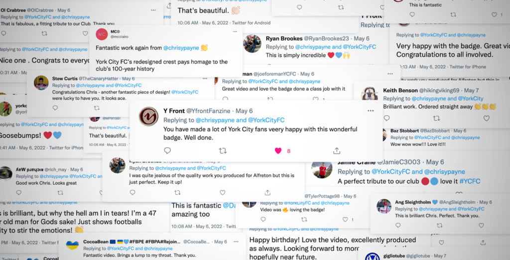
Can you give us some data on the launch? How many impressions etc etc?
In the month of the launch the overall impressions on Twitter alone hit a record high of 17.1million, which is around three times as high as usual. The badge launch video received 80,000 views across all platforms and the home kit received 260k impressions. We also recently launched the third kit which went even more viral, with 1.1million impressions on the launch post, with worldwide coverage and also featuring on the Match of the Day social channels. As you can tell, the reach on social for a club like ours was substantial.
Tell us about the kits selling out and how this compares to previous years?
Our retail team anticipated an uplift in sales due to it being the Centenary kit, so ordered 30% more kit than previous years but we couldn’t have anticipated that the full years’ worth of home kit stock would sell out in just 6 days. We quickly put another identical order in with our kit supplier PUMA and we are now looking at a third order after selling out of that order. I’m pleased to report that this a record for the club and that is even before we have put our chocolate and cream third shirt on sale, which we now expect to sell even better going off the social media response. Our retail team are very busy that’s for sure and the sell outs are a good problem to have – it shows how popular our designs are!

Could you give us some interesting stats about the kit sales? Purchased in how many countries…
The home kit so far has been purchased in 22 different countries – as far as Singapore and proving very popular in countries like Australia, Italy and the USA. York City have truly gone worldwide.
What would you say to other football clubs who are in your position and looking to rebrand? Any advice?
Firstly, consider Chris as your designer. He has a proven track record of creating stunning badges and successful kit designs which will elevate your football club to the next level. Secondly, I would say use the roadmap we have and involve the fans from the very start. This allows for you to tailor your brand to your existing audience and get ‘buy in’ from your die hard supporters which is very important for your launch to be successful. If you are able to please your fanbase and get positive coverage then they will push the crest and kits for you on social media – which is exactly what has happened with us.
Would you recommend Chris Payne to others, and if so why?
Absolutely. You only have to look at his previous work to see that Chris has a proven track record of creating stunning identities for football clubs. He has an open mindset when approaching a project which makes him a joy to work with. He can also provide a roadmap and advice on how to launch – which in the digital era is very important to maximise the potential of your brand. You will certainly see a return on investment if you choose to work with Chris. His work with York City will become iconic in years to come.
I can really see Chris rebranding the top-level teams and organsiations in the future and I’m excited to see where his work takes him.
 Back
Back 