featured reads
Building a brand identity for Brooklyn Football Club
July 11th 2024
11 Minute read

Christopher Payne is an award-winning British designer and passionate football fan. Backed up by his knowledge of football and the execution in design, Payne creates stylish, unique practical and relevant designs for ambitious and forward-thinking football clubs that are looking to progress both on and off the pitch.
Payne has worked with many football clubs and organisations around the world, designing iconic new logos and creating a detailed branding system, that makes the football club standout, grow off the pitch, and thrive in the modern world.
You can see examples of Payne’s work by clicking here.
Contact me¿Hablas español? Yo también. Contactarme.
Brooklyn is an iconic place. It is internationally known for being a hub of creativity, fashion, music, attitude, style, grit, and diversity. It has 2.6 million people, and all the world’s languages are spoken across 77 neighborhoods. Brooklyn is a melting pot of culture and an incubator for what’s new and what’s next. I knew this wouldn’t be a typical project; its outcome had to stand out, push boundaries, and be vastly different.
The man behind the project
Brooklyn Football Club is the hottest new expansion team in the USL. It is a highly desired market and even in its infancy, it is a flagship name in the USL.
The man with the vision behind the project is Matt Rizzetta, an Italian / American entrepreneur whose many business successes have led him to purchase football clubs in Italy, Switzerland, and England and start football clubs in the USA. Matt is astute, passionate, and smart to see the potential of Brooklyn as a hub for soccer.
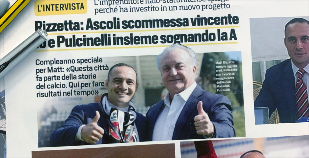
I was introduced to Matt Rizzetta through Max Mansfield, who became Brooklyn FC’s CEO.
Max and I worked together in 2020 when I designed the much-converted crest and brand identity for New Amsterdam Football Club. It was a huge success, and even though Max and I had not spoken for a long time, we kept each other’s contact details.
This led him to call me to tell me all about an exciting new USL (United Soccer League) team that will be launching in Brooklyn soon. He mentioned that the new club would need a brand worthy of the Brooklyn name.
Pushing design breaking the rules.
In the early days of this project, Max, Matt, and I spoke for hours about Brooklyn and collectively got excited about the brand that could be created. It was a great dynamic; Matt and Max are charming, personable, and passionate about football; I was honored to work with them and make their vision for the club become a reality.
With Brooklyn being such an iconic city with a massive influence on fashion, music, and culture, the goal was to design an identity that pushed the boundaries of what you would expect a football club crest to look like.
We wanted to break the rules, challenge tradition, be fearlessly unique. We wanted an identity that would truly transcend football and show up in fashion shoots, music videos, and cultural scenes. We wanted to create an identity that would be brave, bold, and different from day one, transcend language, and become an instant symbol for Brooklyn.
Our ambitions are high. But this is Brooklyn, after all.
Visual identifiers for Brooklyn.
With our ambitions mapped out, we then began figuring out what this identity could be. What symbolism should we incorporate into the design of the identity? Brooklyn being Brooklyn, there were lots of options.
We looked at Brooklyn’s beautiful parks, the old factory buildings, the brownstone offices and residential buildings, fuchsia and other flowers that represent Brooklyn, old navy yards, raccoons, bats, and other creatures that live in Brooklyn’s urban jungle; we looked at old brown brick factories, the steal structures found on buildings and bridges, we looked at the vintage clothes shops and the art deco swirl of the lamppost, and many many other elements that made Brooklyn, Brooklyn.
All options and identifiers were discussed at length, but one icon of Brooklyn was clearly missing from those discussions, one iconic structure that we kept returning to.
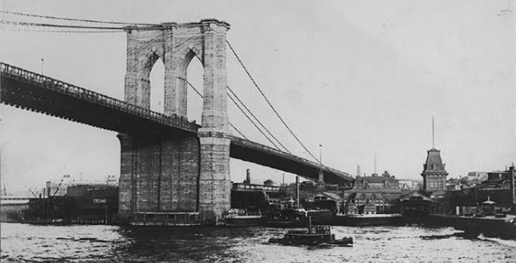
The Brooklyn Bridge.
It would be impossible to discuss Brooklyn symbolism without mentioning the Brooklyn Bridge.
The Brooklyn Bridge is the most iconic Brooklyn symbol. It has stood tall and held its status as a true American icon for many years. Over 4,000 delighted tourists visit it daily, and thousands of articles and top-ten to-do lists mention it.
Early on in the process, we knew that we wanted to incorporate this icon into our identity, so the question was how we could include and represent the Brooklyn Bridge in a way that had never been done before.
It was a tough ask for one of the most pictured and illustrated bridges in the world. How can we design something that is highly unique yet embodies the style and attitude that we originally set out to capture?
![]()
B for Brooklyn.
In early conversation we also spoke at length about the letter B, and asked ourselves the question could be create an iconic mark out of just the letter ‘B’. After all, when you see the letters NY, you immediately think i f New York. Could we do the same for Brooklyn and the letter B?
We looked at 1000’s of B’s, and assessed their style form and presence. We looked at B’s that were carved in stone, and B’s that were spread painted on walls in and around Brooklyn it’s self.
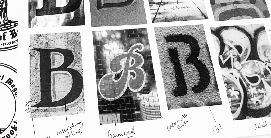
We also looked at the typography on the Brooklyn seal and drew inspiration from the ‘black-letter’ (also know as ‘Old English style’ typography) – we liked the attitude it has, and the sense of history it brings and how this would tie back to the early days of Brooklyn.
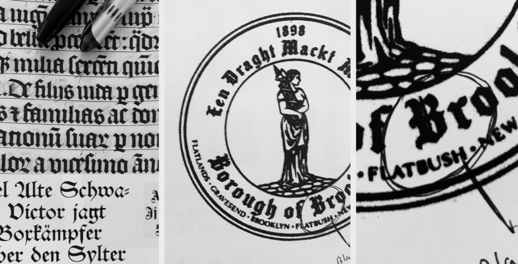
We knew that there was something interesting to be done with the letter B, the question was: how?
Sketching ideas.
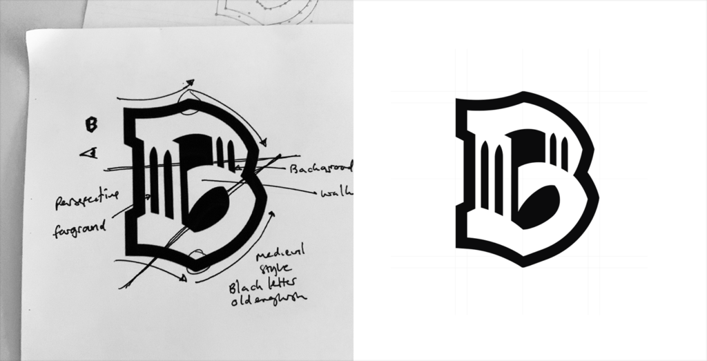
Immediately, I started sketching out ideas that had Brooklyn Bridge’s iconic tower simply and mysteriously incorporated within a traditional shield shape. We dismissed it straight away. It was too safe, too easy, too ‘seen before.’ We needed to think bolder and break some unwritten rules.
This process of sketching out ideas and then dismissing them for not being bold enough continued repeatedly; a sketch would be made and dismissed, often even before it was finished. This was until one quick experimental sketch caught my attention and inspired a new way of thinking.
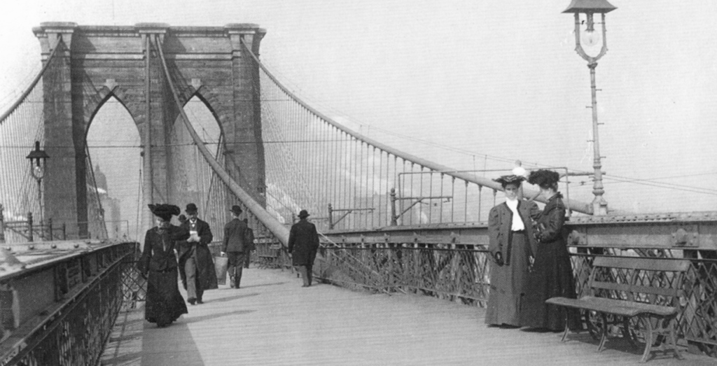
I was aways intrigued by the shapes that makes Brooklyn Bridge so recognisable. The two towers that rise from the water, with each tower having neo-gothic arched shapes carved out of them for thousands of tourists and locals to walk through them, were the shapes that made this bridge recognisable.
I was also very interested in perspective. You walk across the bright from point A to point B. Many of the photos you see of the bridge have the walk way gradually decreasing in size, as it moves to toward a vanishing point. This feeling of perspective intrigued me.
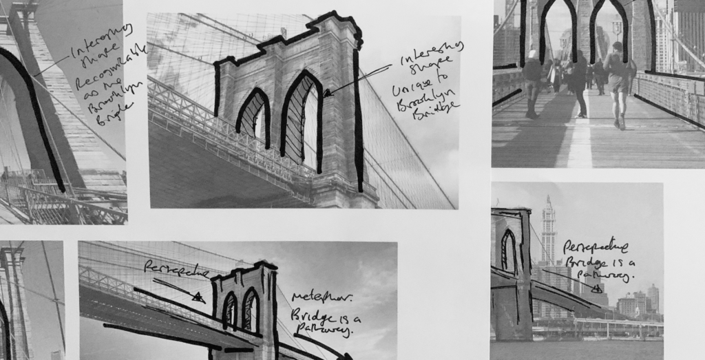
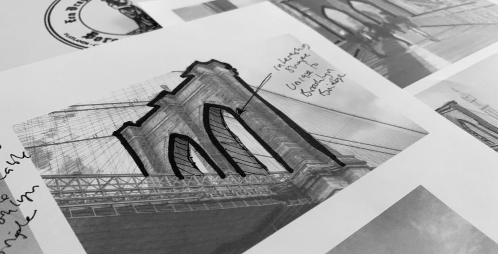
The sketch below kicks off the club’s visual identity. I remember thinking, what happens if we incorporate the Brooklyn Bridge and its iconic neo-gothic arches within the letter B, using the connector of the ‘B’ as Brooklyn Bridge’s walkway? This would bring Brooklyn’s ‘B’ and Brooklyn’s most famous icon together in a clean, simple, and abstract manner. I immediately loved this direction and brought it into the computer to develop more.
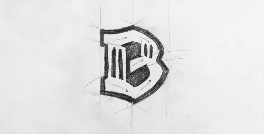
Digitising the design.
Tweaking and perfecting a design like this is a time-consuming and delicate process.
Often, when I design identities for football clubs, I employ a strict grid system that informs and structures the design. However, this wouldn’t be possible with this sketch. It was a free-flowing design, and like the original goal, it would break a few unwritten rules.
As the sketch is without a natural grid or symmetry to draw upon, the design’s balance and weight of all the design’s elements would be done by the designer’s instinct and a designer’s eye.
A design like this requires extensive tweaking and analysis to ensure the right balance, personality, and attitude.
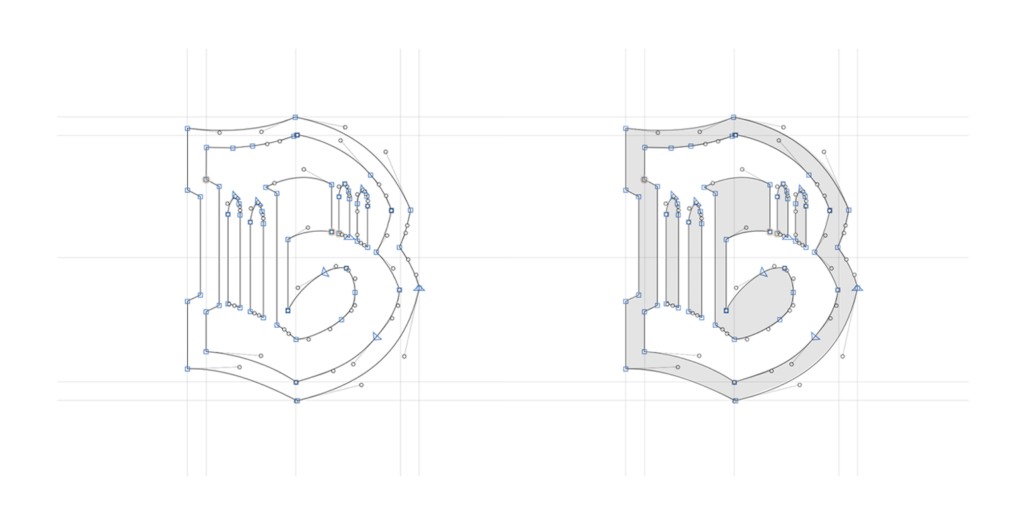
Getting the balance right.
Often, during this design and design analysis process, the time spent away from the design is more important than the time spent working on the design. This might sound counterintuitive, but often, looking at the design with ‘fresh eyes’ (having not seen it for hours or days) helps you realize what is working and what isn’t.
What made this balancing act harder was that the design is a mix of perspectives. The Bridge takes on a three-dimensional perspective, with one tower closer to the viewer, with the walkway and the second tower placed further back in the distance.
And the letter ‘B’ is flat and two-dimensional.
So, perfecting this balancing act required a lot of design expertise.
The colors of Brooklyn.
Once we secured the structure of the design, we started exploring club colors. This was a much-discussed subject, with a variety of options and opinions to consider.
We looked at Brooklyn’s steely gray colors, the greens of the parks, and the natural beauty that Brooklyn has to offer. We explored the blues and oranges of the Brooklyn flag; however, one color range stood out and matched perfectly with Brooklyn’s iconic buildings, factories, bridges, and brickwork.
Brooklyn is known for its brownstone architecture. These beautiful old buildings add notable charm to any walk around Brooklyn.
In addition to the brown tones of the famous old brownstones, walks across the Brooklyn Bridge also influenced our thinking about the club’s colors and identity.
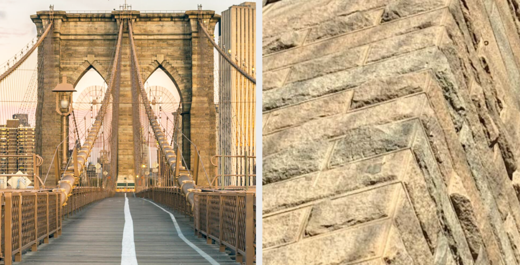
The Brooklyn Bridge has a limestone structure. It is as iconic in its color as it is in its form. This tone of limestone perfectly represents Brooklyn and would make the football club stand out.
We introduced Industrial Black to contrast the tones of brown and limestone and reference the city’s urban nature.
These would be the unique colors of the football club. They would be brave, bold and uniquely Brooklyn.

Wordmarks.
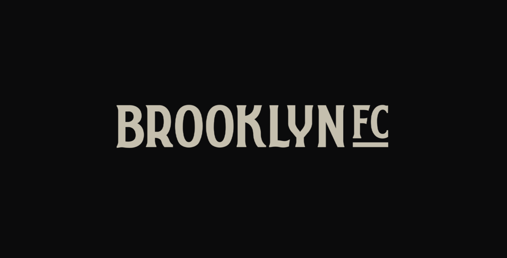
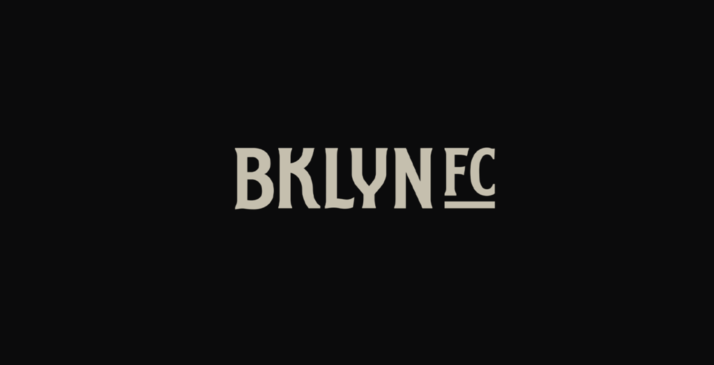
In addition to designing and art-directing Brooklyn Football Club identity, I created a custom typeface and wordmark to complement the Brooklyn brand.
This wordmark was designed to complement the identity and provide more options for club communication and merchandise.
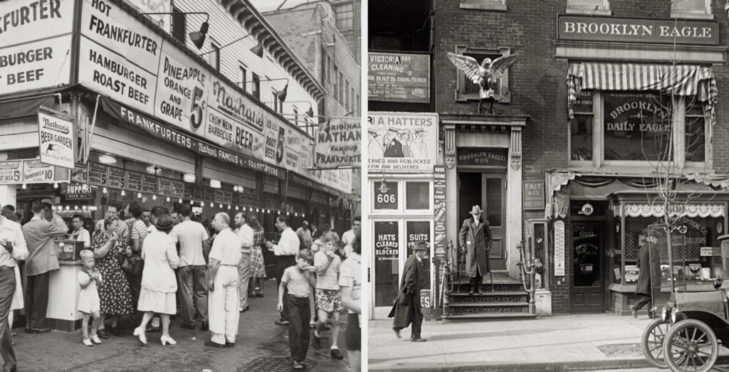
It was designed to have an old-world charm often associated with Brooklyn, and drew inspiration from hand painted street signs and advertising used in 1930’s Brooklyn.
The wordmark would include the club’s most frequently used name, ‘Brooklyn FC,’ and abbreviated versions such as ‘Bklyn FC’ and ‘BKFC.’
The final Brooklyn FC brand identity.
The Brooklyn FC brand was highly anticipated and heavily tested. Working with the football club, we shared this unique identity privately with Brooklyn locals, the creative community, youth soccer players, and industry experts. They all loved the design, its simplicity, its story, its attitude, and its clever references, both in its design and color.
The brand was bold, brave, and extremely Brooklyn. We loved how the design broke the rules; it was like no other identity in the league; it wasn’t bound in a circle or a shield.
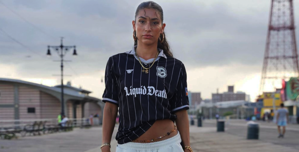
We loved how it worked across digital media, club merchandise, and playing kits. It is an identity design that is simple but also packs in a lot of deep meaning and clever design.

A symbol for Brooklyn.
In addition to its beauty, there was also some strategic thinking behind the design. We wanted the identity to be a symbol for Brooklyn. With Brooklyn being a multi-cultural melting pot of cultures, nationalities, and languages, we enjoyed a design that works work without words and without language. A symbol that could evoke meaning and identity without spelling it out – much like the Nike swoosh, the Apple logo, or McDonald’s Golden Arches. All examples of identities that go beyond language. Brooklyn FC’s identity will be no different. This will be a true symbol for Brooklyn.
Launching the identity in a very Brooklyn way.
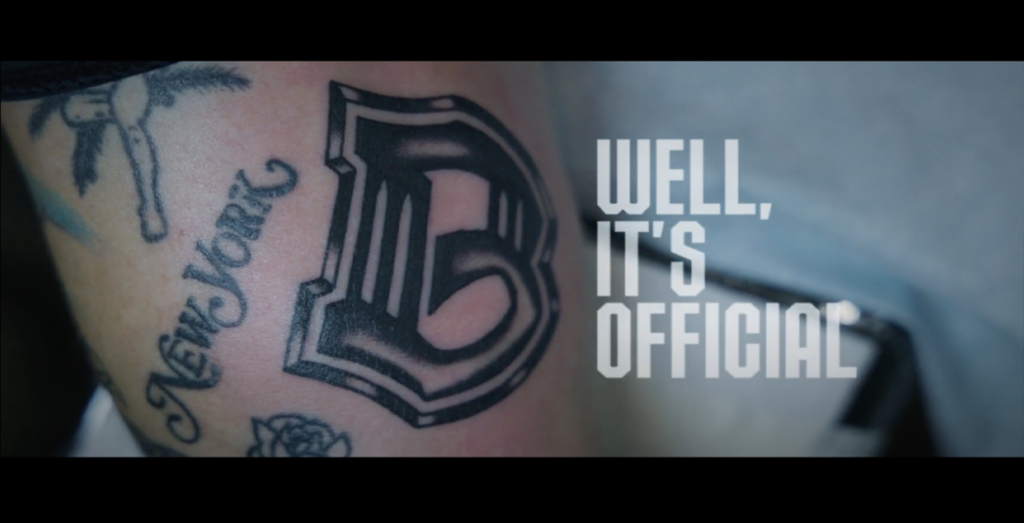
To launch the new identity we did it in a way that only Brooklyn could do, with a short film that would see the Brooklyn FC identity being introduced in the most permanent way.
With Brooklyn’s reputation for cool people who tap into the arts and self-expression, we set our launch film in a Brooklyn tattoo parlor. The 45-second film would see a ready-made diehard Brooklyn FC fan getting the Brooklyn FC crest tattooed onto their skin. It would be a real sign of hardcore fandom and a testament to the beauty and simplicity of the Brooklyn B.
It was a bold, brave, and edgy idea, so it was perfect for Brooklyn.
The 45-second would be a slow reveal; we would hear the sounds of the tattoo parlour, show the tattoo gun, and get a glimpse of the skin being sanitised and prepped for a tattoo before seeing B tattooed into this new diehard fan.
It was bold, brave, and very B, Brooklyn. It was the perfect way to introduce an iconic new identity for an iconic city.
A club for Brooklyn.
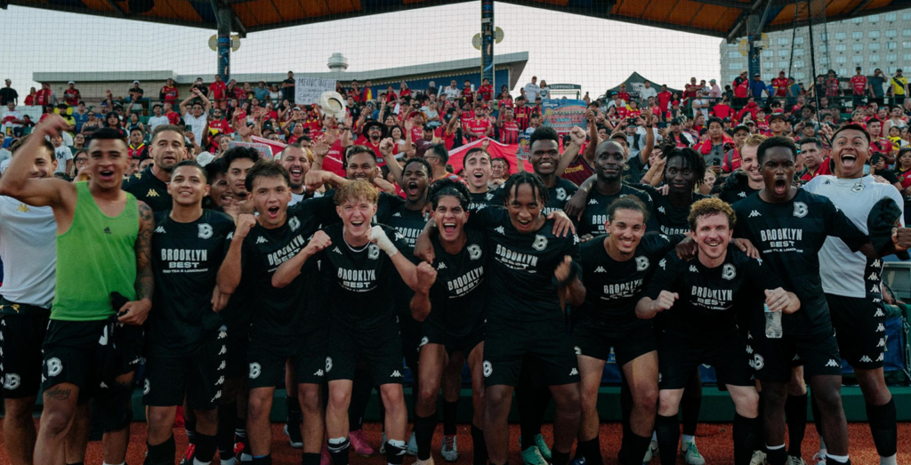
Since the launch of Brooklyn FC’s identity, the club has gone from strength to strength as it looks to win the hearts and minds of proud Brooklynites and and multinational New Yorkers. This is a club thats isn’t afraid to ruffle a few feathers, pave their own path in the concrete jungle, and like the design, the club isn’t afraid to push boundaries and do things differently.

Read more, see more.
– Learn more about Brooklyn FC
 Back
Back